5 Tips for Building Your Custom Mobile Site
Hello fellow Showiteers! I'm sure many of you are wondering about the impact of Google's announcement of the changes coming to SEO and mobile on April 21st. With even more importance being placed on mobile, I thought I would be of some service by giving you a helping hand to get your mobile sites up and running!
Here are 5 great tips to get you on your way for seamless design and mobile experience for you and your clients!
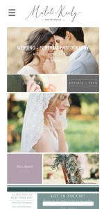
Mobile Tip #1: Use the mobile menu bar icon. It makes visitors' visit so much easier to navigate through your site. The menu bar lists a directory to your pages for easy to understand navigation. Plus, I give them more than just a menu bar. I like to create bigger navigation options below the front page gallery for those visitors who may not be very savvy on their mobile device. Check out Matoli Keely‘s mobile site for an example how to utilize both a navigating page and menu bar icon. http://www.m.matolikeelyphotography.com/
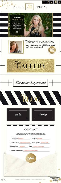 Mobile Tip #2: Adding a “CALL” button and/or Contact form on your front page (heck why not all pages) is a great way to allow potential clients to contact you right away. It's an ease of use feature that allows your viewers to quickly send an email or call you with just one click! Check out Ashlie Dobbin's mobile with these fabulous features! http://m.ashliedobbins.com/seniors-home-2
Mobile Tip #3: Did you know you can change the length of your vertical mobile pages? You sure can!!! How? What I do is I duplicate my already transferred mobile stylegroup. Click on the main stylegroup folder; you will see the page dimensions over on the right of your screen. From there you can now make it longer, wider or shorter. Make sure to click update. Tip # 3.5 using width of 1040 instead of 900 fills a tablet as well as a mobile.
Mobile Tip #4: Make sure to change out your galleries to html 5 galleries. One of my favorite uses of the scrolling gallery is that you can make it a”Swipe” gallery by turning “OFF” the auto scroll allowing your clients to thumb-n-swipe through your images at there own pace. Another extremely mobile user friendly feature.
Mobile Tip #5: LAYERS!!! Make sure to unlock the layers you want to adjust (lock button is on the left of your screen in the layers section). Make sure to unlock edges as well (edge locking is on the right side). This now gives you control on where to place and align your layered elements.
Start Your Free Trial
(Free for 14 days)
No credit card required
