Showit 3.0 – Sizing Your Mobile Site Made Easy
It's here. Available to the public and ready to download directly from the Mothership. The new Showit update adds some amazing features that I shared in our First Look and on Showit Live. After designing mobile sites for some of you awesome Showiteers, here are a few sizing tips to get you started!
Design sizes that work for both Tablets and Phones
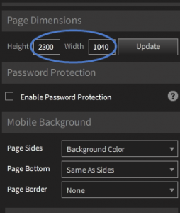
Showit's default sizing is designed for iPhone users in mind, and starts at 1500px long by 900px wide. This is a great place to start for many mobile users, and since it's the default you don't need to change a thing. One thing to note, using these dimensions means that when you flip an iPad sideways you will start to get gutters or bars (usually the same as your background color) appearing on the sides. For this reason our preferred dimensions for our projects starts at 1900 long x 1040 wide. We have found this to work extremely well as a starting point to cover both mobile phone platforms and tablets. When you are setting up your Stylegroup you will want to make sure you are on the Stylegroup level, and then make the changes under Page Dimensions on the right hand side. When you need a page(s) that is longer than another, you will need to create a new Stylegroup and increase or decrease the page length as needed. It's often easier to duplicate your current Stylegroup (to keep the menu, etc) and then delete the pages you don't need, and re-size for the ones your are working on! An important note to keep in mind is that the shorter your pages are, the faster your site will load. So be clear on your message, goals for mobile users, and keep your mobile site focused. We have the ability to cater to both mobile and desktop visitors in unique ways, so coping your desktop site in it's entirety is rarely the best solution.
It's OK to have less pages on your mobile site!
Fonts sizes need to be bigger.
Don't expect to use 14pt font on your desktop site, and use the same size for mobile. The best thing you can do with text is re-write it to make it more concise, use less of it, and make it more visible (bigger font) on your mobile device. Case Study: Amy & Jordan Demos For Amy and Jordan's site we decided to get rid of their top navigation in the traditional sense because there was too much for their mobile site and it wouldn't help the flow. If you visit their site (amyandjordan.com) the navigation text they use is at 11pt Times International. It looks fantastic and gives them the room they need for their navigation options! However, for Jordan and Amy's mobile site, the minimum font size we used was 34pt on Times International. We did this using our preferred page width of 1040px wide. Compare the two sites by visiting their website on your mobile device! It's often hard to nail down a good size because each font is different, and every page dimension layout will adjust that effect. If we would have used a different font, 34pt may have been to small still! If we used the default Showit page dimension of 900px wide, it would have looked a bit big, so make sure to spend the thought going into your sizing choices- it will save you hours! Recap: Getting Started on Your Mobile Site. There is a lot of information here, but I will break it down into our standard starting settings for each mobile conversion or site build.
- Start your Page Dimensions at 1900px long by 1040px wide — this will be optimized for tablet and phones
- Keep pages that need to be longer or shorter in their own Stylegroups. – Your home page may be longer than your contact page or thank you page. Remember that page lengths are set on the Stylegroup level.
- Decrease the amount of text on your mobile site. – this is a great time to revisit your message and make it more concise.
- Text will need to be bigger. – We like starting with fonts at 32pt and testing it before we design the site on a blank Stylegroup. Don't be afraid to publish and check it out on your phone first!
- Each font will be different. – Play around with them, and make sure to pick fonts that are easy to read and communicate your message clearly.
We are super excited to see what you guys are creating with this new release. If you have questions feel free to tag me (Jason Toevs) in the Showiteer group on Facebook! I can't wait to see your new creations! Keep an eye out for more on mobile design articles here on Showiteer.com!

Mike O'Rangers
Start Your Free Trial
(Free for 14 days)
No credit card required
