4 Questions to Consider When Designing Your Logo
Starting a successful photography business is hard. Extremely hard. Once you figure out how to take decent photos, you are suddenly thrown into the vicious world of business, design, sales, marketing, and SEO. Trying to figure it all out is enough to make any creative person want to vomit. Here are a few questions that we learned to ask about design from making our own tragic logo mistakes.
1. Who is your current audience?
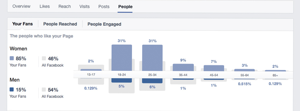
A lot of people think that Facebook is a dying form of social media, but it actually has some great tools that can be especially helpful to someone in the early stages of their photo business. Knowing your audience is the first step to figuring out if you are headed in the right direction. The “insights” tab allows you to see exactly what type of people are interacting with your content. Here is a sample of what ours looks like:
As you can see, our (wedding photography) business has been specifically marketed to women between the ages of 18 and 34, which is our main clientele. But don't be fooled, things weren't always this peachy.
2. Who is your target audience?
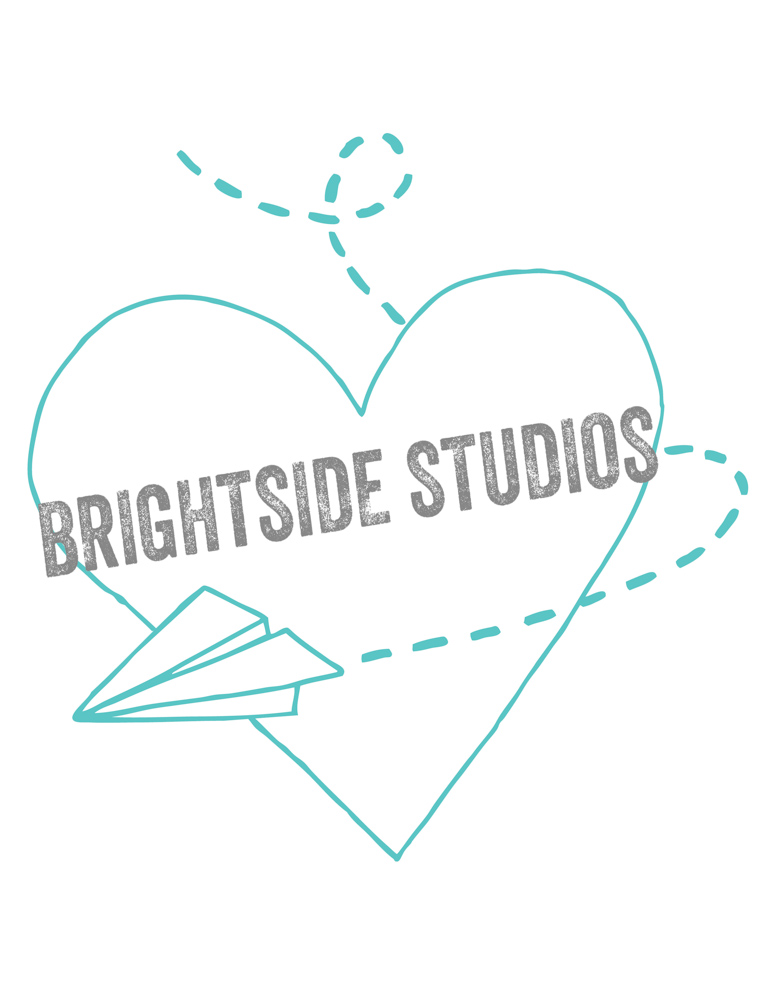
When we first started our business, this was our logo. Before you judge, just remember that we were trying to be cute.
Our logo and name was just that: cute and whimsical. There was no real meaning behind it. It did not truly represent who we are. When Sarah and I decided that we wanted to shoot high-end wedding photography, we realized that “cute and whimsical” may potentially be translated as “unprofessional” or that “we don't really know what we are doing”. The design also gave the impression that our photography was geared more towards families and children.
It is important to recognize that what you name your business and how your logo is designed will attract a certain target group. Make sure you are attracting the right clientele! We realized that our name and logo were geared toward a completely different clientele than we wanted to reach. Because of this we changed our name to Jamie & Sarah, which is meant to market us as individuals and the idea that we are a husband and wife team. Here is our current logo:
3. Has it been done before?
It is important to consider if the font or shapes you are using are common, particularly in the photography community. Is your logo unique enough to stand out in the sea of other photographers? Or are you giving off this vibe with your logo:
4. Is it recognizable?
Is your logo one that will be recognized if your watermarked picture shows up on Pinterest? Will people be able to associate it with you when they see it? Your logo needs to be simple enough that people do not have to squint to see the name yet unique enough to grab the attention of potential customers browsing the web.
Lets have a discussion! What else have you learned about name choosing and logo design from your own mistakes? Lets get honest here people! No one gets it right the first time!

Start Your Free Trial
(Free for 14 days)
No credit card required
