Choosing Your Branding Color Palette
Color can set the tone for everything, evoke emotions, and make your clients think and feel different things. This is why your brand's color palette is a crucial part of your brand, and something that you should think through.
Pay attention as you go places, both in person and on the web, to the colors that they use in their branding and decor. Orange and yellow are said to make you feel hungrier, which is why a lot of fast food restaurants use them. Blues and greens are said to be soothing, which is why they are used in many doctors' offices. Each color can make you feel a certain way, and color can even attract or deter a potential client.
When choosing a color palette, think first about colors that you like and don't like. Obviously if you hate a color, I wouldn't recommend using it in your color palette. Your brand should represent you, above all else!
Next, I would recommend thinking about the colors that you have chosen that you do like – what do they say about you or represent to others? What other brands use similar colors? We tend to associate some colors with certain brands (ie – Tiffany Blue). Do the colors that you have chosen complement your work? If you have chosen primarily dark colors, but your work is very light and airy, they may not suit one another.
Pinterest can be a great place to see how well color combinations work together. What sort of items and brands are these colors being used on? Things may pop up in your search that you didn't consider when choosing your color palette.
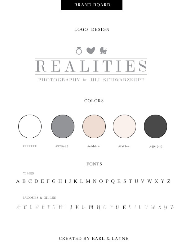
Choose more than one or two colors. This is something that I see quite often in brands, a very limited color palette. I usually choose at least 5 colors when creating a brand for a client. This way, they have several options to choose from, and ways to incorporate pops of color into various design elements of their printed materials, website, etc.
My general rules are to choose two to three main colors, a color pop color, and a neutral or two in order to create a nice color palette with some depth.
Sometimes, white, off white, black, or gray are in my color palettes, so don't forget to choose neutrals that suit your brand as well. I will also use darker and lighter hues of a color in the palette for added depth if needed.
We would love to hear what inspired your branding colors – post a comment below to let us know!
Start Your Free Trial
(Free for 14 days)
No credit card required


