Tips to Save Time on Mobile Design
Designing a mobile site can be a daunting task: Reformatting, moving things around, resizing…oh my! However, knowing a few handy things can help speed the process up quite a bit and make you a happy camper in the end.
[dropcap]1[/dropcap] GO IN WITH A PLAN
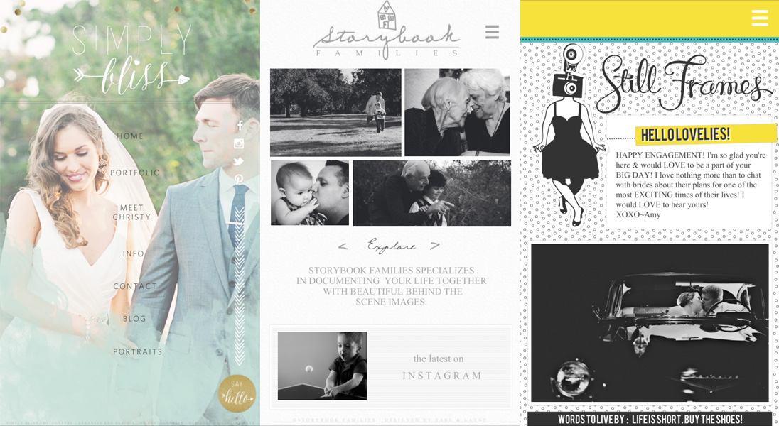
Planning your mobile site out ahead of time makes designing so much less daunting of a task. I typically will send my clients out several examples of mobile sites and ask their preferences. Do they prefer a long scrolling mobile site or a page-by-page conversion? Do they like the look of a mobile menu or not? What style of galleries do they prefer? Will all of their widgets convert over to mobile easily, or will we need to leave some things out? Knowing all of this ahead of time can help me pre-plan how the site will flow to make sure that it's going to be easy to use and functional for their clients.

Different format mobile sites (from left) http://www.simplyblissphotos.com, http://www.storybookfamilies.com, http://www.stillframesphotography.com
[dropcap]2[/dropcap] LEAVE OUT SOME PAGES
This can be hard for some people to let go of, but my thinking is that mobile sites are more or less for people more on the go. People who are on their phones probably have less time to go through endless pages of content on your site. Obviously, you want to make sure that the most important content is there, but having, say, 20 FAQ pages will not only hurt your site load time, but will quickly steer those on-the-go clients away from the site. This is also a time-saver for you because you have less work to convert pages over, so in my book, it's a win-win.
[dropcap]3[/dropcap] MULTI-LAYER RESIZING
Oh, Showit, I love you for adding this feature! Because you have to resize your layers in mobile, making them larger, text sizes larger, etc., this time-saver is invaluable! I typically select all of my text on a page and resize all together to the size that I'd like, then restructure the layers to fit within the Showit stage. This is so much quicker than resizing layers one by one and then trying to position them where they go. To do this, simply select multiple layers, an resize using the resize handles on the bottom right of the bounding box that appears after selection.
[dropcap]4[/dropcap] REPLACE LAYER
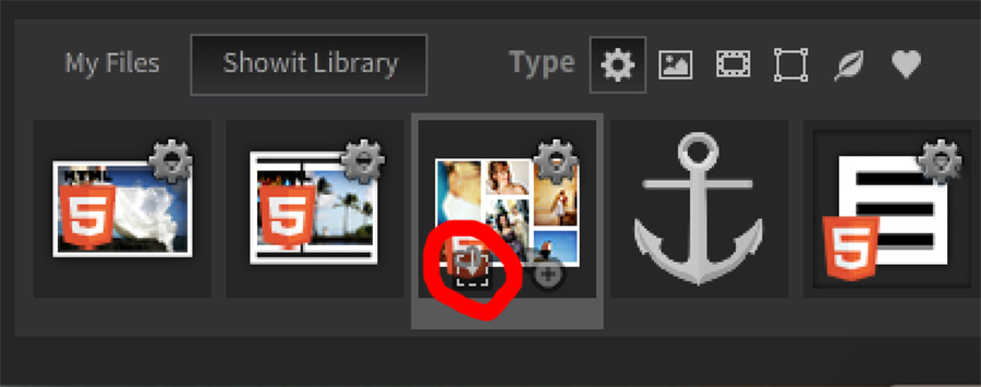
Replace layer is an invaluable tool to know for any job, but it's especially awesome for mobile sites when you're replacing a gallery with a mobile-friendly version, or replacing any other layers. You can replace any layer with any other type of layer* by first selecting a layer on the stage, then finding the type of layer you want to replace it with and choosing the “Replace Selected Layer” option when hovering over (it's the circled arrow above!) To retain the size of that layer exactly, hold down Shift when replacing the layer and the new layer will stay the exact same dimensions as the old one.
* One thing to be conscious of when replacing layers: If replacing a NON-mobile friendly gallery layer with something other than a gallery, the new layer will take on the properties of the old gallery layer. This could result in odd things happening if that layers is accidentally clicked on.
[dropcap]5[/dropcap] SHIFT + ARROW KEYS MOVEMENT
I love this addition that Showit gave us, which is a major timesaver, especially for people who are OCD like me and don't want to line things up a hundred times. Holding Shift while moving layers from side to side or up and down will actually move the layer 5 pixels, rather than just one, which is a major timesaver across the board.
Hopefully with these tips you'll be able to tackle your mobile site with ease and quickness!
Start Your Free Trial
(Free for 14 days)
No credit card required


